Turn Your Data Into Actionable Intelligence With Custom Reporting
Operational and financial reporting can be a significant challenge for many businesses. Both accounting and ERP systems come with basic reporting capabilities that can provide answers to rudimentary questions, such as how much inventory of item XYZ do we have right now, what did we spend on supplies last month, what are the month-to-date sales figures for customer ABC, etc. This type of reporting fulfills an immediate need for information, but it does not provide the context nor intelligence needed to make informed decisions about resource allocation, pricing strategy, efficiency trends and goal alignment. Though there is acknowledgement of the importance of these critical factors, businesses frequently do little to close the gap between what we call “canned reporting” and actionable intelligence to their detriment. If you are one of these businesses, do not follow the herd, break away and begin leveraging your transactional data to your benefit.
At Profitwyse, we specialize in helping privately-held businesses close the intelligence gap in their reporting processes. Here are a couple of examples how we helped clients turn their data into actionable intelligence.
#1
A Prescriptive Report Example for Setting Reorder Points
Frequently, we see prospective clients utilizing QuickBooks “canned” reports to guide their operational and financial business processes. For example, one of our clients purchases about half their products from vendors in China. Before our arrival, this client ran the standard QuickBooks reports to determine when to order new product. This included a Sales By Item Summary report which would tell them how many units have been shipped in the last 12 months. The second report was an Inventory Stock Status by Vendor report that includes useful information such as stock on hand, reorder point (if computed and input), reorder quantity (if computed and input) and Sales Week (no idea how this is computed, annual sales / 52, most recent month of sales???). During our 3D Financial Analysis we noted that the 240+ days of inventory on hand was more than 100 days greater than the industry cohort for this client; consequently, it became clear that our initial efforts would focus on reducing inventory.
One of the clients largest Chinese vendors had a 4-month lead time from the time a purchase order (PO) was placed until the manufactured item was loaded on a boat in China, crossed the Pacific ocean, was off loaded from the boat in Long Beach, passed through U.S. customs and was trucked 85 miles to our client’s warehouse . Here is a brief description of what reports and processes we used to reduce this client’s inventory levels.
Step #1: Establish a Data Warehouse for Shipments and Inventory Levels Outside of QuickBooks
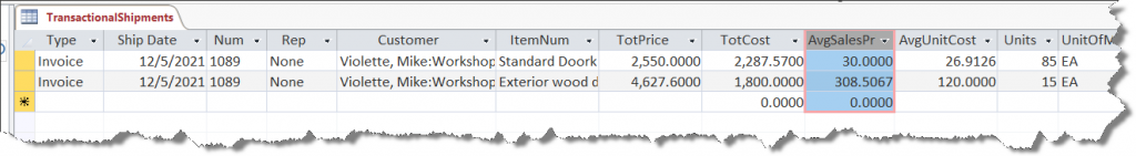
- Getting sales history data from QuickBooks requires some effort. The best place to start is from a Detail Transaction Report. This report can be modified, filtered and exported as CSV to provide the data needed to start analyzing historical shipment activity. Here is a snippet of the QuickBooks Transaction Detail Report report with the relevant columns highlighted:
![]()
- Using Access as our data warehouse platform, we are able to transform and summarize the QuickBooks Transaction Detail Report, summarizing each shipment into a single record in Access. So each invoice line item is one record in our TransactionalShipment table with the Transaction Type, Ship Date, QB Invoice Number, Sales Rep, Customer, Item Number, Total Line Item Price, Total Line Item Cost, Average Sales Price, Avereage Unit Cost (you cannot see it below), units shipped and unit of measure. A snippet of the TransactionalShipments table appears as follows:
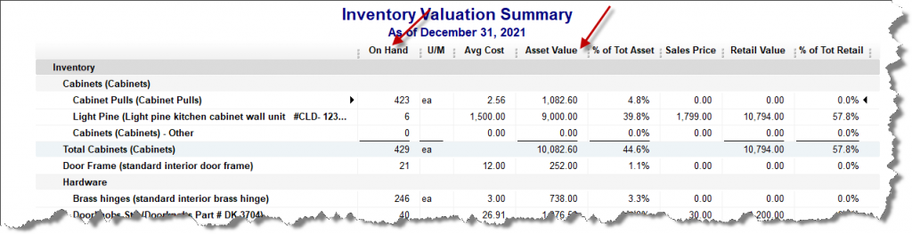
- The next step is to retrieve the month-end inventory balances using the QuickBooks Inventory Valuation Summary Report as a CSV export, which appears as follows in QuickBooks with the relevant columns highlighted:
.
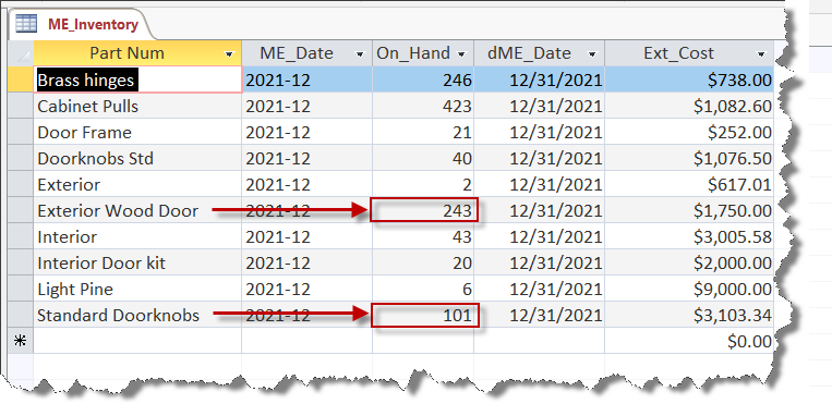
- Again, using Access as our Data Warehouse platform, we can transform and append the above QuickBooks CSV export data into the ME_Inventory table as seen below:
Step #2: Pulling it all together and generating prescriptive analytics
With the shipment history now exported from QuickBooks to our data warehouse along with the month-end inventory results, we can begin to get some new perspective on our transactional data. The next layer would be viewing the sales trends over time.
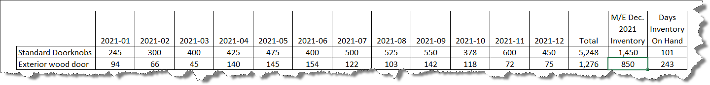
Above, we can now look at the past 12 months of sales history that is integrated with the month-end December inventory balances. Our app has computed the 12/31/2021 days of inventory on hand (DIOH) to help provide some additional context to our inventory efficiency.
Further leveraging the transactional data we exported from QuickBooks to our data warehouse, we can now generate more analytics beyond just DIOHs, and compute reorder points for our two products. Here is a summary of the analytics generated by our app:
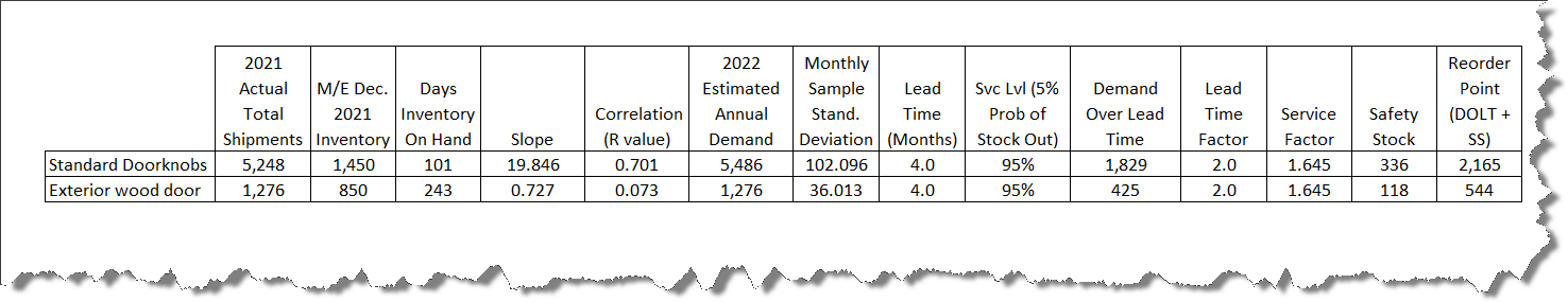
Each column of our prescriptive analytics reports is as follows:
- 2021 Actual Total Shipments: This is just the total units shipped over the prior 12 months.
- M/E Dec. 2021 Inventory On Hand: This is the units on had as of the last month in our reporting period—December 2021.
- Days of Inventory On Hand: This is computed by taking the most recent period ending inventory balance and dividing it by the daily average shipments (e.g. 1,450/ (5,248 / 365 Days).
- Slope: This is computed by Excel and provides an indication as to whether sales are increasing or decreasing. In this case, Doorknobs are increasing on average 20 (19.846) units per month. [Excel function =LINEST(Range of Y Values, Range of X Values)]
- Correlation (R Value): We use the correlation value to determine how accurately our slope is projecting an increase or decrease in demand. The r value is between 0 and 1, the closer to being a perfect fit with our simple time series analysis. The Doorknobs indicate a .701 r value which is fairly high. We spoke with sales and determined that the 20 unit per month growth as indicated by the slope is accurate and should be included in our reorder calculation. The Exterior Door demand is flat; consequently, we will just assume 2022 demand will be the same as 2021 demand. [Excel function: =CORREL(Range of Values #1, Range of Values #2)]
- 2022 Estimated Annual Demand: After review of the Slope calculation and our discussions with the Sales department, we incorporated in Doorknob projections a 20 unit a month increase in the 2022 demand plan. We left the Exterior Door demand equal to 2021 actual shipments.
- Monthly Sample Standard Deviation: This is an estimate of the monthly variances around the shipment numbers and is only a sample given that it was taken from the prior 12 months sales history. [Excel function: =STDEV.S(Range of units shipped prior 12 months)]
- Lead Time (Months): This is the lead time required from order placement with our China vendors until the products arrive at the client’s receiving dock, on average.
- Svc Lvl (5% Prob of Stock Out): This is the service level the client is seeking for each product. So a 95% service levels means there is a 5% chance of a stock out from a statistical perspective.
- Demand Over Lead Time (DOLT): This is computed using the 2022 annual demand adjusted for the number of months of lead time required. It represents the client’s estimated consumption of the units over the 4-month lead time required between order placement and receipt at their dock.
- Lead Time Factor: This is a bit beyond the scope of this explanation, but it is required to compute the safety stock. This is the square root of the lead time. [Excel Function: =SQRT(Lead Time Months)]
- Service Factor: This is just the number of standard deviations from the mean required to achieve a 95% service level. [Excel Function: =NORMSINV(Service Level %)]
- Safety Stock: This is the product of Sample Standard Deviation * Lead Time Factor * Service Factor which is the number of units required to meet the desired service level.
- Reorder Point: This is the sum of the Demand Over Lead Time (DOLT) + Safety Stock.
Utilizing the analytics above our client is able to determine that at 1,450 units on hand is below the 2,165 unit reorder point and needs to take immediate action to prevent a stock out. There is currently no need to order Exterior Doors which are above the 95% service level reorder point.
#2
A Predictive Report for Forecasting Customer Demand
Sales reps are busy people and one of our clients wanted a predictive report to help improve their sales rep efficiency with a predictive report that was also easy to understand. What we proposed and developed for this client was a tool that helped their sales reps determine when was the best time to contact customers regarding reorders. With this report, a sales rep can determine which customers may be running low on specific products, contact those customers and very likely take a new order.
Step #1: Defining the Key Metrics
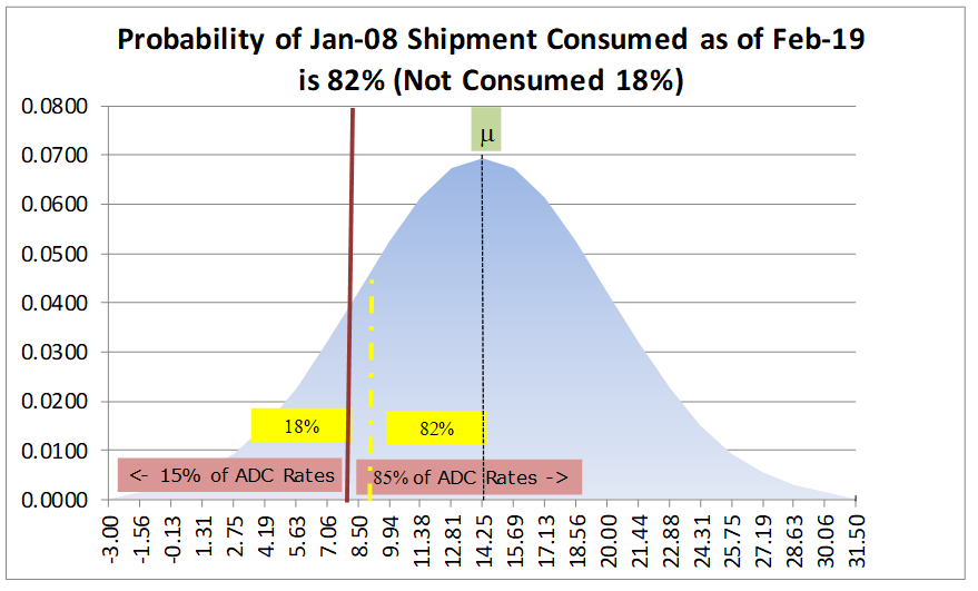
- For this application, we needed to analyze each customer’s product-level average daily consumption (ADC) rate. To derive ADC rates, we created a VBA app that analyzed every product shipped over the past 12 months. The VBA app computed ADC rates for each shipment, starting with the oldest shipment and worked forward to the latest shipment. ADC rates were computed by taking the number of units in an individual shipment and then determining how many days transpired until the next shipment. By dividing the number of units shipped by the number of days that had transpired before the next shipment gave us the daily consumption rate for that shipment. We would then average individual consumption rates to compute the ADC rate for each product, by customer. In the example below, the most recent shipment was made on January 8th. The date of this report is as of February 5th, which is 28 days after the last shipment on January 8th.
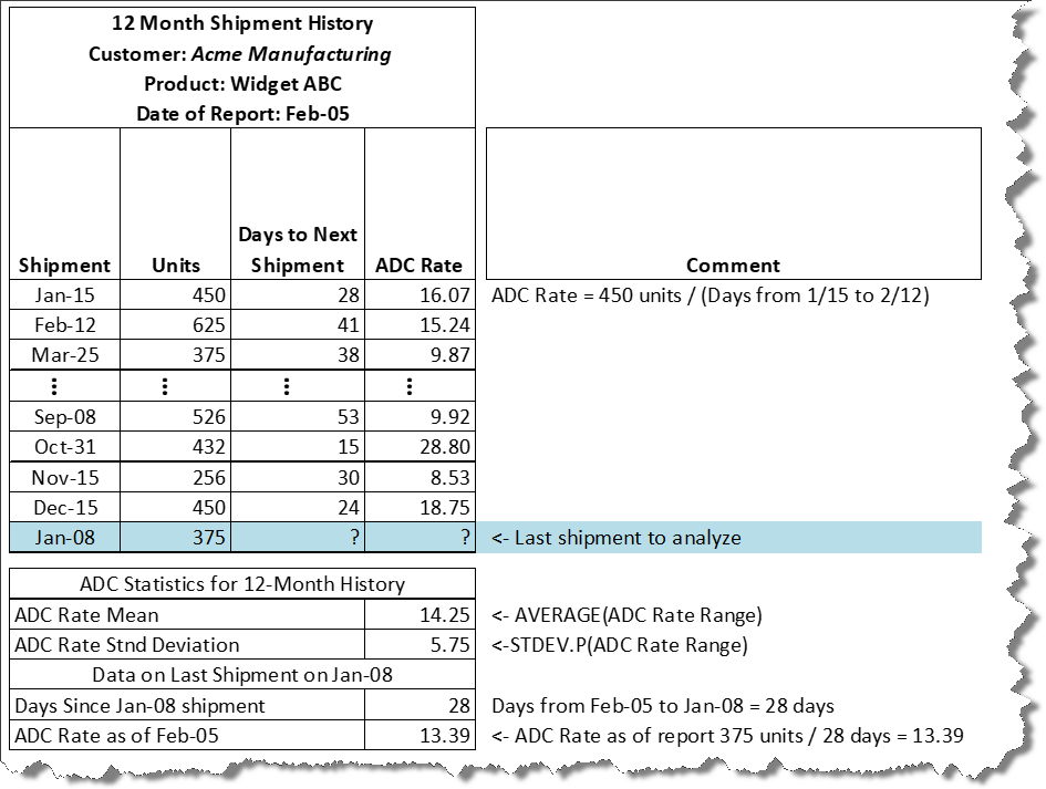
- At of this point, the VBA app determined that the mean ADC for the prior 12 months is 14.25 units per day with a standard deviation of 5.75 units. As of February 5th—the date this report was generated–the customer had not placed a new order for this product. With all this statistical information, we now want to know when this customer should be called regarding reorder. The Sales team decided that once the likelihood of an order being fully consumed was 85% or higher, the sales rep should take action by contacting the customer.
Step #2: Applying the statistics needed to compute the probably
- As of today which is our hypothetical report date—February 5th, it has been 28 days since the January 8th shipment. Now we can determine if the probability of our January 8th, 375 unit shipment, which is an ADC of 13.39 (375 units / 28 days) exceeds our 85% threshold. The report uses Excel’s NORM.DIST() function (NORM.DIST(13.39,14.25,5.75,TRUE)) which returns 0.44 or 44%. Graphically, this appears as the broken yellow line on our standard normal distribution below:
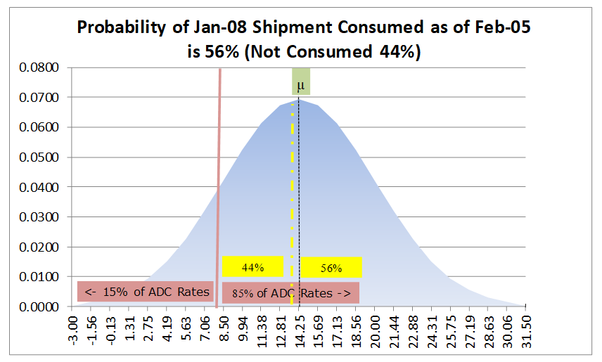
- As of the February 5th report date, there is 56% chance that the January 8th shipment has been consumed and a 44% chance that it has not been consumed. Given that the probability is closer to a 50-50 coin toss, than our 85% threshold, there is no compelling reason to call the customer yet.
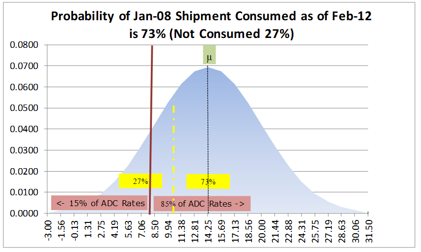
- The VBA app creates a report that evaluates the probability, using the NORM.DIST function over several more one-week intervals. On the same report, the probability for February 12th is computed with a computed ADC of 10.71 (375 units / (28 +7 days)). A NORM.DIST(10.71, 14.25,5.75,TRUE) equals 27% (or 73% chance of having consumed the January 8th shipment), which you can see below still does not reach the threshold for a call.
- Using the same calculation on the same report, as of February 12th, NORM.DIST(8.93, 14.25,5.75,TRUE) computes a 18% probability of having not consumed the January 8th order. The sales rep would then use their discretion to make a call sometime around this date.
- This report was set up for the client to run monthly and automatically generated a separate report for each sales rep that was emailed by the Excel app saving significant administrative time for the client while also improving sales rep efficiency.
Step #3: Making it easy for the Sales Rep with a report based on simple metrics
- To make the most effective use of our client’s sales reps, the report needed to be easy to understand with indicators where action was required. We created an app that automatically summarized the results and added in the analytics required. Here is a snippet of a report using our example above:
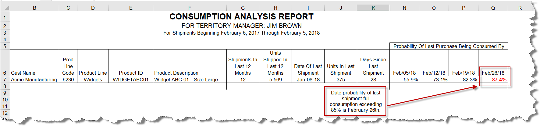
- As you can see from the example Excel report above, Jim Brown only needs to go looking for the products with the probabilities highlighted in Bold and Red font to determine who should be called about repeat orders.
- The formula for computing the probability of the last order being fully consumed by a future date is as follows:
= NORMDIST((Avg. ADC – (Units in Last Shipment/Days Since Last Shipment))/Standard Deviation for ADC)
As you can see, there are many ways midsize businesses can begin to leverage their transactional data to make better business decisions, even those using QuickBooks have the power. Profitwyse can help you take your company to the next level by taking advantage of what you already possess—your transactional business data—enabling better decision making that improves profitability and cash flow. So whether you are using QuickBooks, Fishbowl, Sage, SAP Business One or Microsoft Dynamics, Profitwyse can help you gain more greater actionable intelligence using your transactional data. Contact us today to learn more.