
TUTORIAL CONTENTS
- Why Does Your Business Need to Create an Excel Dashboard
- Tutorial #1: Dashboard introduction, data sources and other considerations
- Tutorial #2: Workbook Layout Considerations & Structure
- Tutorial #3: Setting Up the Dashboard Data Sources
- Tutorial #4: Graph Design and Formatting
- Tutorial #5: Custom Number Formats for Excel Dashboard Graphs
- Tutorial #6: Expanding the Dashboard Graphs
- Tutorial #7: Adding More Complex Balance Sheet Metrics
- Tutorial #8: Pulling it All Together
- Summary
How To Create Excel Dashboard In 8 Steps That Will Drive Action
Why Does Your Business Need to Know How to Create Excel Dashboard
Here at Profitwyse, we establish a financial results dashboard for nearly all of our clients. Dashboards are an important management tool that create accountability within an organization and help business owners accomplish important objectives with respect to revenue growth and profitability. This blog post the step-by-step process we use to establish financial results dashboards for out clients.
We will show you how we utilize QuickBooks, PlanGuru and Excel to produce an integrated business management reporting system. Please scroll to the bottom of this blog post to request a copy of the dashboard template used in this video series.
Tutorial #1: Dashboard introduction, data sources and other considerations
This is the first video in a series intended to help accountants, financial analysts and others generate a financial management dashboard. In this first video, we discuss how to source data and how we structured this example, which includes the use of QuickBooks, PlanGuru and Excel. We also describe how these tools work together to generate an efficient and effective communication/accountability tool. This example is exactly the same process we use with most of our privately held business owner clients.
Tutorial #2: Workbook Layout Considerations & Structure
Because many of our clients use QuickBooks for invoicing, bill paying, and general accounting, drilling down into product level profitability is not easy. Though QuickBooks is an excellent accounting platform, it does not produce much in the way of analytics. With our product-based clients, we will setup processes for downloading their transactional data, which typically consists of invoicing detail, and transform that data using Access or some other database tool. The goal is to format the invoice line item transactions into the following format: 1) invoice #; 2) Item or SKU; 3) ship date; 4) units shipped; 5) invoiced amount for line item; 6) cost amount for line item; 7) Customer; and 8) Sales Rep. (Note: there are third-party applications, such as QQube, that will perform this transform step for you, eliminating the need for Access. More on QQube in a future post.).
Tutorial #3: Setting Up the Dashboard Data Sources
An important part of creating an easily maintainable dashboard is how you set up the data sources to be accessed by the Excel graph object. In this video we describe how we set up the data sources for our graphs.
Tutorial #4: Graph Design and Formatting
In this 4th dashboard video we show you the formatting changes we make to our dashboard graphs, this includes formatting the chart areas, setting up a 2nd Y axis, modifying the colors, sizes and marker styles on both column and line objects.
Tutorial #5: Custom Number Formats for Excel Dashboard Graphs
In Tutorial #5, we describe how to create custom number formats that work with dashboard graphs and complete the Dashboard template.
Tutorial #6: Expanding the Dashboard Graphs
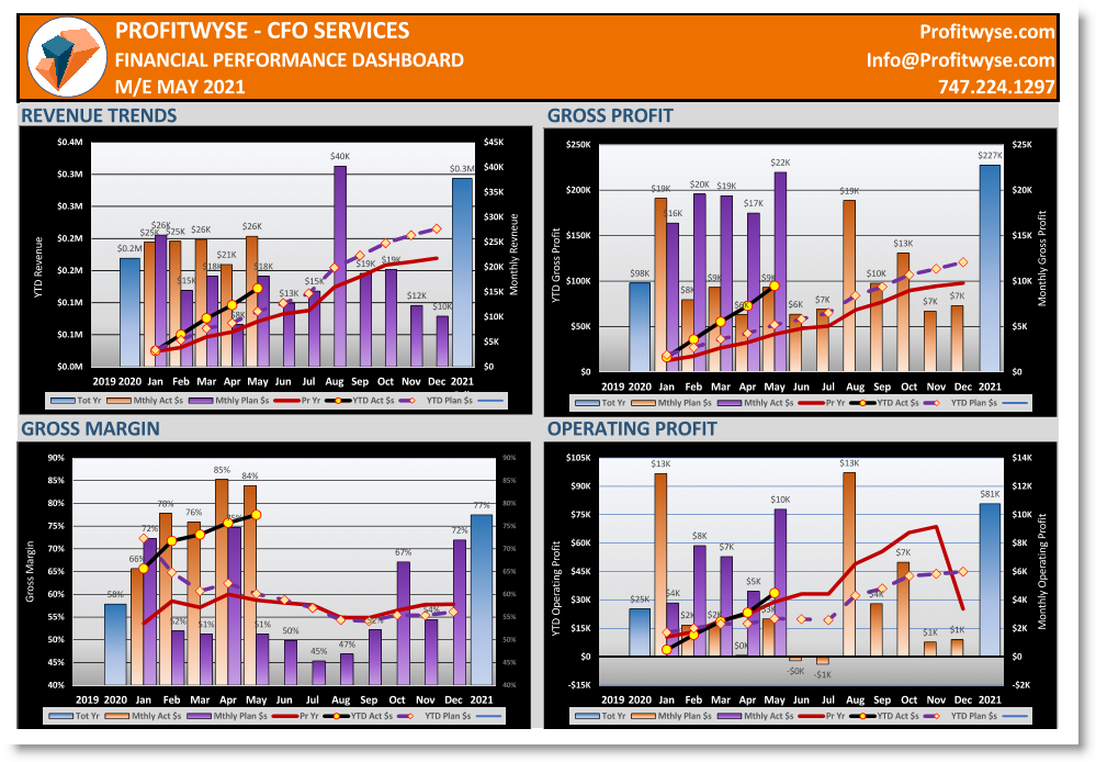
With the completion of the graph template in Tutorial #5, we expand the graphs to include the following: 1) Gross Profit; 2) Gross Margin; 3) Operating Profit; 4) Operating Margin; et al.
Tutorial #7: Adding More Complex Balance Sheet Metrics
In this, installment we show you how to compute and add Days Sales Receivables (DSR) and Days Inventory On Hand (DIOH) metrics to our Excel Dashboard as well the Leverage Ratio. All three metrics are important to both business owners and outside stakeholders to help better understand how management is utilizing resources to generate growth and improve cash flow.
Tutorial #8: Pulling it All Together
In this installment, we pull together the entire dashboard and take you through how the dashboard will be updated from QuickBooks through PlanGuru to the financial management dashboard. Then will how you how simple it will be to update the dashboard with the latest monthly financials results. Also, we illustrate how to resolve issues with the X axis when using both the Primary and Secondary Y axes.
Summary
Having the ability to communicate complex financial information in an efficient and effective manner is a valuable skill. Using the Dashboard Tutorial above provides many of the skills needed to create your own dashboard for your employer or client, and at the same time add tremendous value to the organization. If you need additional help establishing a similar tool that integrates data from your accounting systems into a financial management dashboard, contact us today.